How to Create Branded AI Images That Do Not Look Generic
Better AI visuals come from separating concept, photography, brand assets, typography, and review instead of asking one prompt to do everything.
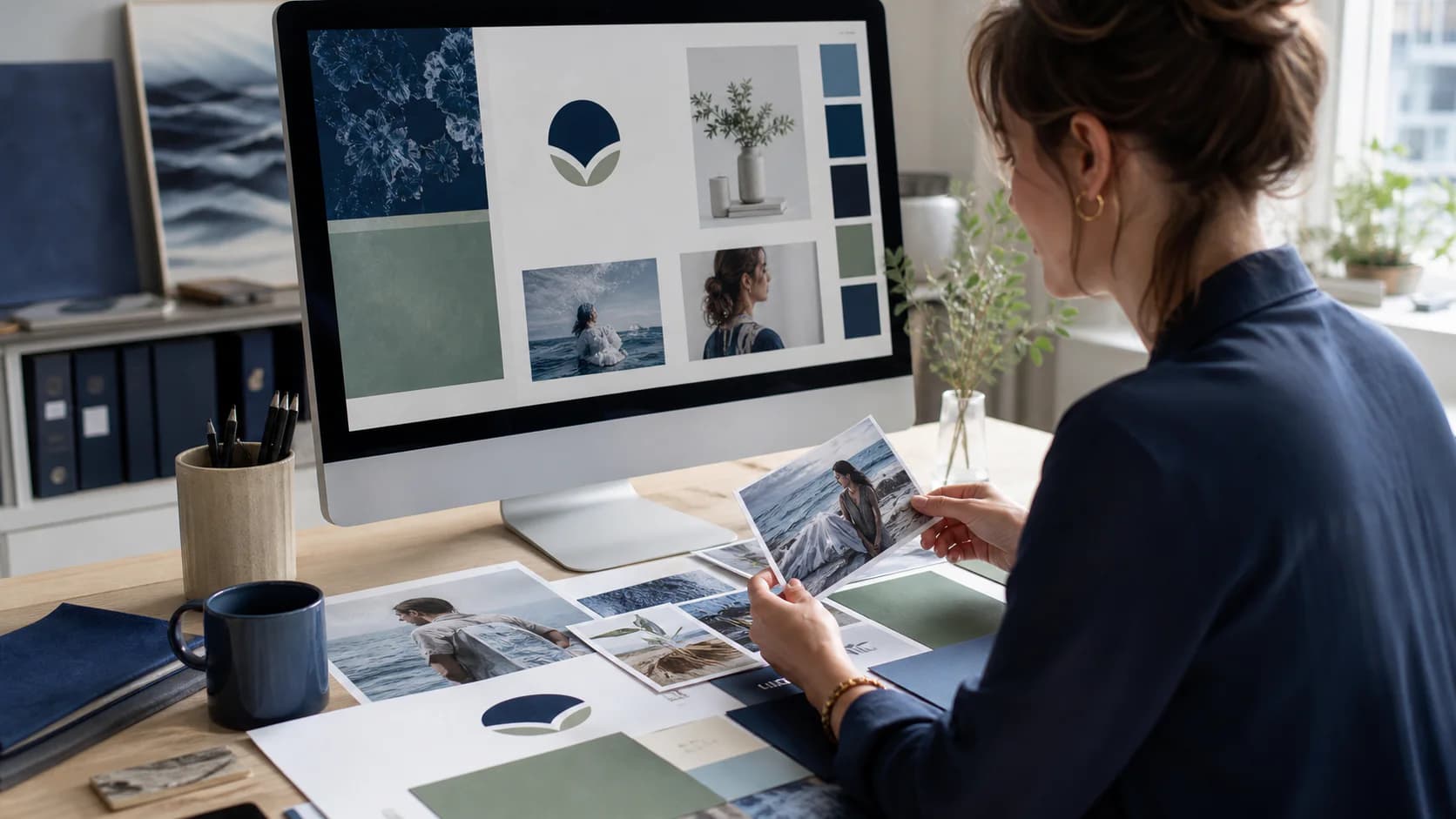
Generic AI images usually come from generic direction. A prompt asks for "a professional image about automation," and the result is a glowing laptop, floating icons, a blue office, and a logo the model has tried to redraw.
The solution is not a longer pile of adjectives. It is a visual workflow that separates the decisions an image model can make well from the elements that need exact control.
Choose the visual idea before the style
Start with what the audience should understand.
| Visual idea | Useful when | Example |
|---|---|---|
| Person at work | The human use case matters | Support lead reviewing a handoff |
| Operational scene | The environment makes the value specific | Coordinator working above a warehouse floor |
| Product view | The interface is genuinely informative | Approval queue with source panel |
| Process graphic | Sequence or comparison is the subject | From incoming message to reviewed draft |
| Object or detail | A physical product anchors the story | Industrial component beside its technical documentation |
| Typographic announcement | One concise message is the campaign | New role or feature launch |
If every post uses "person looking at laptop," the feed becomes repetitive even when the photographs are technically good.
Direct the photography precisely
Useful image instructions describe:
- Subject: Who or what is present?
- Environment: Where does the work happen?
- Action: What is the person actually doing?
- Framing: Where should the subject and negative space sit?
- Lighting: Daylight, studio, industrial, or evening?
- Texture: Real skin, paper, metal, fabric, glass, or machinery?
- Mood: Calm control, concentration, collaboration, or momentum?
- Exclusions: What visual cliches should not appear?
For a manufacturing article, "operations coordinator reviewing a technical request from a real factory office" will produce a more useful image than "future of AI in manufacturing."
Keep logos out of the generation step
Use the original uploaded logo as a real asset. Do not ask an image model to remember or redraw it.
A reliable logo workflow includes:
- Validate the uploaded file.
- Remove a solid background when appropriate.
- Preserve enclosed white details and internal negative space.
- Create a clean transparent version.
- Scale without distortion.
- Place it with controlled padding and contrast.
| Logo problem | Better treatment |
|---|---|
| White rectangle around mark | Process the background into transparency |
| Jagged edge | Use a soft matte and inspect at display size |
| Logo invented by model | Composite the original asset after generation |
| Poor contrast | Use an approved light or dark variant |
| Oversized placement | Set a repeatable maximum size and safe margin |
Render important text separately
On-image text should be exact. Generate the underlying scene without text, then add the headline in a controlled design layer.
This gives you reliable:
- Spelling.
- Font choice.
- Line breaks.
- Alignment.
- Safe margins.
- Contrast.
- Responsive crops.
Treat image generation as photography and art direction. Treat typography and logos as design-system work.
Use aspect ratio as part of the composition
Do not generate a square scene and hope every crop works.
| Destination | Practical composition |
|---|---|
| LinkedIn landscape | 1.91:1 with strong horizontal hierarchy |
| LinkedIn or Instagram portrait | 4:5 with subject and headline stacked safely |
| Instagram square | 1:1 with central focal area |
| Story or Reel cover | 9:16 with generous top and bottom safe zones |
| Blog hero | 16:9 with detail that remains clear at card size |
Create a composition for the destination or generate a wider master with intentional crop space.
Review like a designer, not only a prompt writer
Inspect the final asset for:
- Hands, faces, reflections, and device geometry.
- Impossible interface perspective.
- Random text or fake logos.
- Repeated stock-photo composition.
- Overly smooth skin or plastic materials.
- Lighting that does not match the environment.
- Headline legibility at mobile size.
- Brand mark accuracy and spacing.
Rejecting one weak image is cheaper than making the whole brand look careless.
Build a visual direction library
Store approved preferences such as:
- Preferred photography style.
- Environments relevant to the business.
- Real customer use cases.
- Allowed and excluded subjects.
- Brand palette and logo variants.
- Headline treatment.
- Channel crops.
- Examples the team likes and dislikes.
Steadframe's Social Media Manager uses brand setup, visual-direction choices, image generation, controlled text overlays, approvals, and scheduling as connected steps. The broader social workflow guide explains how those visuals support a campaign rather than exist in isolation.